AUDREY MLADINA
UX Design / Level Design / Game Production
UI & UX in Virtual Reality
My work on diegetic menus and overall UX in virtual reality
Working on user interfaces--as well as overall user experience--can be especially tricky in
virtual reality. Normal, stacked menus tend to break player immersion. For my game team's junior
project--Cures & Curios--we wanted to make menus and non-game related items as diegetic
as possible. This meant coming up with items that could live within the world and function as a user interface.
Below are some low-fidelity wireframes showing some concepts I presented to the team for both
the main and pause menu. The drawings are a little messy, as they were mostly notes for myself.
I've included some basic descriptions of the ideas I had and why I thought they would work--or not.
1
In this version of the pause menu, I came up with the idea for a spellbook known as the Book of Menus. The player uses a spellbook in the game to access recipes for potions, so I thought it would tie in nicely to the actual gameplay. The menu would feature a different page for each option, e.g., "Quit Game"or "How to Play".
While this menu idea tied in well to the actual gameplay, it presented a problem that can be potentially dangerous: too much text. The book would need to be held close enough to the player's face in order to read. This would especially be the case for things like the "How to Play" page, which often features more text than your average "Resume Game" page. In order to fit everything, the text would have to be fairly small, which poses a problem for those who are visually impaired.
Another issue this idea posed was the physicality of it all. While holding up a book and turning pages is not difficult, it can become tiresome if someone wishes to get in and out of the game quickly. We also would have had to limit the number of pages so that the player wouldn't be endlessly flipping through them to get to a particular part of the menu.


For this pause menu, I imagined a screen that could be pulled down in front of the main shop window. This window is where the customer interacts with customers, so I figured it would do a nice job of extracting the player from the exterior world. Once the screen was down, the game world would be paused and the player could use the wand to point at various menu selections on the screen.
To match the theme, I figured this would be a pull-down scroll that might be used for signage and/or note-taking in the 19th century. We ended up going with this version, but made it into a modern-day projector screen for time's sake. While it was a fun option that was definitely diegetic, players felt it broke immersion as the type of projector didn't match the theme of the game. It was also on the slow side, so players sometimes looked away and didn't see it descending.
While sticking to diegetic UI elements was important to us, this version of the pause menu made it clear that we must also keep the design relatively quick. The lack of instantaneous feedback (other than the sound of the projector descending) lost the player's attention and left them turning to something else. As of recently, my work on the project has been focused on completely redesigning this system to address these problems.
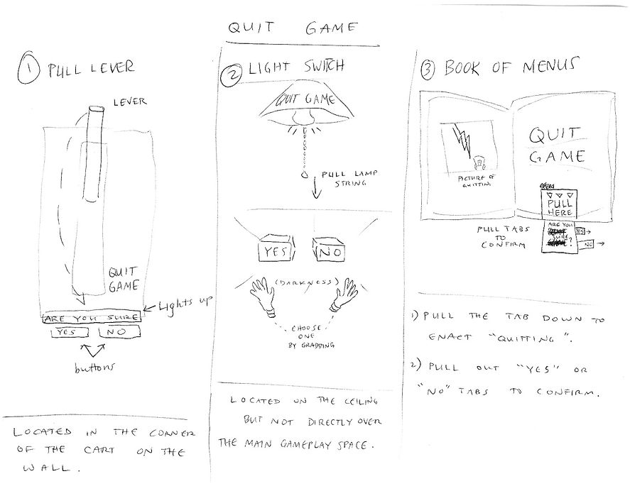
2
These were some ideas I had for quitting the game. Some of them were intended to be external from the actual pause menu, whereas others exist within the main menu. My concept for these was that quitting the game would be something akin to shutting down the shop for the night.
The first idea was for a fancy, golden lever that would be on the wall of the player's cart. The cart would have a flashy sign that clearly indicates its purpose. Once the player would pull down the lever, small buttons would light up on the wall underneath the lever. These would be yes/no confirmation buttons so the player could back out if they wished to continue playing.
The second option was a light switch on the ceiling of the cart. A small rope hanging down would allow the player to turn out the light and quit the game. This would then bring up two glowing items in the dark that would be the yes/no confirmation for quitting. Though it's not depicted in the picture, I intended the items to be crystal balls to go along with the theme.
The final idea I came up with would be within the Book of Menus referenced in 1. This would be a page that features an image of the cart closing up shop. Like the other book pages, this would feature tabs for the player to pull down when making their selection.
3
This is a quick overview of the main menu ideas described below. Like the pause menu, I really wanted to make the main menu feel as much connected to the game world as possible. All of these designs used diegetic elements that corresponded to the mechanics and theme of the game.
I also wanted to use the main menu as a basic teaching ground for the player. By demonstrating some of the core mechanics in the main menu, I figured we would have a lot less tutorial work to do in the actual game. In particular, the first and second menu ideas make use of the spellbook and cauldron--two key elements of the gameplay.

4
In this main menu, the player would start in a very dark space. Ahead of them would be a podium with a spotlight shining down, guiding the the player towards it. The spellbook on the podium would contain pages the player could flip through for the various menu content.
One of the potential problems this posed was that the menu information was not always immediately available to the player. If they can't see where the options menu is at all times, they might become frustrated at having to constantly search for it. To address this problem, I thought of tags hanging off the side of the book that could flip the player to any particular spot.
One other problem this concept presented was the size of the text. The book would be fairly life-size, if not a little large. This meant, however, that the text would have to be small enough to fit everything on the page. As mentioned earlier, too much reading at too close of a distance is a problem. It costs the player time and sometimes even leads to complete disinterest. If a player finds the text too small, they may just skip over it.
Conversely, the benefit this option provided was that it introduced the player to the spellbook. It's pivotal to gameplay, as it's where the player finds the recipes for the potions their customers request. Introducing the player to this in the main menu would definitely be a good way to capitalize on setting a focused mental model up in the player from the very beginning.

5

In this main menu, the player would be in a dark area similar to what's described above in 5. Instead of the spellbook being at the center of the space, the player would find the cauldron. Next to the cauldron would be some small tables with crystal balls on them representing the various menu options. The idea here was for the player to pick up the crystal balls and throw them into the cauldron.
The cauldron is one of the most important elements of gameplay, as it's what the player mixes ingredients in to make a potion. My initial idea was to go off of of players' intuition to throw the crystal balls into the cauldron. While playtesting proved that most people did, in fact, understand that they were to throw the items into the cauldron, we still needed some assistance for those who didn't. The idea here was to show an arrow in an arc from the "Play" crystal ball to the cauldron if the player hadn't done so after a certain amount of time.
One thing that can never be taken for granted when developing for VR is a human being's natural inclination to pick up everything in sight and throw it as far as possible. For games that don't use a teleportation mechanic--like ours--it's important to have a system that returns items to their original location. There were many times where a player would throw a menu ball off into the distance only to be unable to retrieve it.
6
This main menu is similar to the one described in 6, with one key difference. Since players love destruction in a virtual realm, I decided to come up with a concept that plays off of these basic heuristics.
The menu options would again be crystal balls, but instead of throwing them into the pot the player gets to break them. Many players wanted to see glass shattering when they threw a potion bottle, so I figured we could emulate that excitement in the menu as well. While this option doesn't necessarily teach the player much about the mechanics, it definitely focuses on giving them what they want.

7
As you can see, designing UI elements in VR can be tough, as there are a lot of caveats to think about. Below are a few of the things I found to be most important when designing UI in virtual reality:
-
Go diegetic. This is especially true in VR, but in most games I think it holds true that UI elements within the game world limit the potential for loss of immersion. Try to focus on making the menus as interactive as possible.
-
While going diegetic, keep within the theme. Even if the menu element is interesting, you can cut immersion very quickly if that element doesn't go with the rest of your theme. Keep the menus relevant to actual gameplay.
-
Use a menu as a teaching opportunity. Introduce the player to the mechanics and theme as early as you can. Teaching in games can be one of the hardest things to do, so accomplishing some of that task in the main menu gets you ahead.
-
Keep it fast. Whatever kind of UI you design, make sure that the feedback happens very quickly. The human brain's response time starts to significantly drop off after only a fraction of a second, so make sure that something indicates to the player that the menu has been engaged within that timeframe. At the end of the day, nobody wants to wait 5 seconds for a menu to pop up.
IN ESSENCE